You make less money than you used to. Blame your iPhone.
For years, economists have been puzzling over why, despite unprecedented technological innovation since the dawn of the Internet, productivity is flat. Really, nobody seems to know why! Look no further than this week's news to find a consensus opinion that the just-around-the-corner cure for lagging productivity numbers is—wait for it—more technological innovation.
Productivity is a curiously-named economic measure that essentially boils down to "amount of money you generate for your employer over time." And because the promise of most technology is to enable people to do work faster, we should expect technology's useful impact to be measurable, even with an (oversimplified) equation like Labor + Technology = Productivity.
But something has clearly gone wrong. If we work backwards, we already know productivity is flat. And we are equally certain that technology has improved over the last twenty years. That leaves just one variable for which a negative value could explain the productivity gap: maybe we're literally doing less useful work every day. Reflecting on my own experience, I'd go a step further and ask, what if recent technological advances are actually decreasing our productivity?
Busy != Productive
Think about your personal capacity for deep insight and creative thought today versus a time in which you were less constantly connected to the world. Ask yourself, how often do you find your dreams for the day's efforts unfulfilled, especially after you realize it's now 5pm, as if you've been lost in a fugue state, spending the bulk of the day compulsively refreshing a rotation of various inboxes (e-mail, texts, chat), and never successfully finding a productive groove to accomplish whatever you'd set out to do?
While I might feel very tired at the end of the day and very deserving of both a paycheck and a cold beverage, I'm often unconfident that I've actually earned either. I'm busy all day, every day; but I'm productive so rarely that I'm too ashamed to estimate a figure here.
To make matters worse, our dutiful reactions to inbound communication is having the exact same effect on our friends and colleagues! We may be trying to demonstrate timely responsiveness, but to others we're the person on the other side of the net, volleying their hot potatoes right back at them!
Even for the minority of users who successfully disable unnecessary notifications and curate their inboxes, it won't fix the broader problem that software is training most users to spend their days oscillating between being interrupted by notifications and being distracted by the compulsive tendency to stay on top of an array of disparate inboxes (for whom what little time that remains is wiped out by theh attention residue effect). This wouldn't be a problem but for the fact that other people are sending me two orders of magnitude more texts, tweets, and e-mails than they were a decade ago.
Wait, I clicked because the title said "iPhone" and now I feel baited
Yes, this post's title blames a general societal problem on Apple expressly because we've reached a point where only provocative clickbait headlines pierce through the noise we're surrounded by. So, let's get right down to it and talk about the iPhone and how it was at least the harbinger of this dystopia we now find ourselves in.
As an adopter of the original iPhone in 2007, I'll never forget the glares I earned when I was caught ignoring my (much more interesting, but smartphone-less) spouse during dinner. Or the dawn of a worry that whenever I stole a few minutes from uninteresting work assignments to check the news on my phone, I'd return to the work only to find it even less interesting than I did before.
The unintended problems caused by increasing connectedness didn't fade with time, it was the perception that these are problems at all that decreased as meteoric smartphone adoption gradually normalized our collective state of permanent distraction. If anything, iPhone's subsequent innovations have only exacerbated these problems. APNS made these distractions pro-active, plentiful, and instantaneous. IAP opened the door to hyper-optimized monetization of distraction under the guise of gameplay loops. Continuity worked to multicast distraction across every one of our screens, ensuring that our ring tones would play in surround sound every time we received a spam phone call. I wish it was satire to say you'd be hard-pressed to design a touch interface that more closely resembled a Skinner box than the pull-to-refresh UI control that the iPhone made famous.
As an individual user, I've exerted an absurd amount of effort to shut out these distractions, and I still struggle daily with what amounts to an addiction to novel-seeming-but-rarely-very-novel distractions. If my own efforts have proven so futile, it's left me to wonder: am I unusually addicted or am I, as an early adopter, unusually ahead of the curve in realizing it?
Many have stumbled upon similar ponderings in recent years, but few have attempted to take an inventory of specific classifications of how modern software platforms distract people. Fewer still have bothered to imagine or propose potential solutions to these problems.
So let's dive deeper! I'm going to detail five types of problems that increased "connectedness" has posed as well as some potential solutions for each. Regardless of whether Apple is to blame for having caused these issues, they are undeniably the only company in a position to fix any of them.
Besides, Apple is unveiling iOS 12 next week, so it's an opportune time for us to ask Craig Federighi to consider tacking a few announcements onto his Keynote deck.
1. Death by a thousand banners
For having built what is certainly the largest-scale notification system on the planet, iOS notifications sure are dumb. None of Apple's platforms have a concept of batching notifications, much less intelligently prioritizing them. This issue is self-evident to anyone who texts often with a chatty sender while they try to get literally anything done.
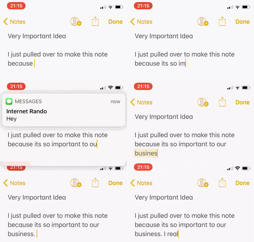 Me, trying to focus while swiping away some rando's texts
Why doesn't iMessage batch notifications? Especially if the user has indicated (through the swipe-up-to-dismiss gesture) that they don't want to see them? And why trust every app to implement this sort of self-policing, when the underlying platform can better infer a user's intent?
Taking this line of reasoning just a step further, why doesn't iOS defer unlikely-to-be-urgent notifications until users are in a good context for dealing with them? Free ideas of things iOS could do here:
- Prioritize notifications based on app, usage behavior, and content (all of which Apple has) and decide whether to alert the user immediately, on the hour, in a digest at the end of the day, or to suppress them entirely
- Use Continuity for good by muzzling notifications across all devices when the user likely can't act on them. My Apple Watch knows when I'm running, so what good does it do to wake my Mac's screen to catch an e-mail notification out the corner of my eye, other than to stress me out for the rest of my jog? (As it stands, I'd get those notifications on the watch, too, even during a workout)
- Bring its devices' sensors to bear by identifying and reacting to various life contexts. For example, Siri will likely soon be able to identify its user's specific voice, so if a microphone detects said user is in the middle of speaking during a conversation, don't interrupt their train of thought by tapping their watch or buzzing their phone.
- Establish those contexts across devices. If I'm located in my living room and there's a movie playing on my Apple TV that ends in five minutes, why can't a notification to my phone be delayed until the credits start rolling?
- In many cases, stop listing notifications on the lock screen. Unless the user is clearly waking the device to respond to a notification, it's likely their intent was to do literally anything else, and the presence of an unrelated notification is likely to distract them from accomplishing that intention
The subtextual reason that none of the above are obvious, must-have features is because it's treated as axiomatic that the best notification response time possible is "instant". Apple has essentially achieved that, and we have collectively accrued plenty of life experience to suggest it was not the right metric to optimize for. Most of the things our devices notify us of aren't as valuable as the time we lose to being distracted by (and then recovering from) them.
2. Our inboxes have inboxes
If only this were only about notifications.
The week I started college, I only had three inboxes I was sure to check every day: my one (and then, only) e-mail address, a physical answering machine I had mounted to my dorm's wall, and my physical mail box in the lobby.
Today, I've ditched the answering machine for voicemail, and I still have only one physical mailbox, but I have 5 e-mail addresses across various organizations. Oh, and I also have to check Twitter, of course. And Instagram comments. And Facebook (simply on account of cross-posting from Instagram). Also Facebook's Messenger (which I loathe using, but which is the only way a number of people ever contact me).
While most users will never change any of their system's default settings, many savvy users have disabled the vast majority of distracting notifications. But the world has already moved on, and our various social groups largely expect us to stay abreast of one or more inboxes where they communicate. This has led many of us to develop compulsive tendency to visit a round-robin of inboxes and refresh each of them, which can take so much time that once I'm done, I go right back to checking the first inbox. It's true that some of my friends have successfully declared bankruptcy from ever checking this or that app, but it often comes at the expense of walling themselves off from some group of people, and at work it requires the privilege to be able to get away with ignoring colleagues for hours or days.
Slack is when I realized how toxic "inbox creep" has become. Not only am I and most of my friends a member of numerous Slack organizations (at the time of this writing, I have been added to 25 of them), each organization represents an unbounded number of inboxes. You have the default #general channel, sure. But each topic the organization aims to cover is generally represented by its own separate channel, each representing its own unread message counter. Look no further than this comically complex flow chart attempting to document the rules Slack must have in place to notify users of new messages.
In fact, and I can't repeat this loudly enough, every app that displays a badge icon represents 1-to-n inboxes you are responsible for checking. The mere act of clearing inboxes is time-intensive work that provides next-to-no value and at a tremendous opportunity cost by risking that users will mistake the resulting fatigue for accomplishment.
What can be done about this? Well, for starters, Apple could rethink the badge UI it places over every app icon:
- In both the iOS and macOS app switcher (which is only brought up when a user intends to switch to a specific app), is it really appropriate to display the unread badge on every recent app, potentially directing users to open an app other than the one they actually intended to open? No well-designed product would actively disrupt a user's intention to open, say, a Pages document by showing them that Somebody Might Have Said Something in Slack while they Command-Tab over. I'd nix the badge UI altogether in app switchers
- Apple could build a single unified inbox app (call it Inbox) that collated every apps' notifications and into a simple UI that was actually effective for triaging them. The current Notification Center UI is not (as much as Apple keeps trying to make it) a destination that anyone actually visits on purpose. But what if this Inbox was the only place you needed to check to ensure you hadn't just missed out on anything? One place in which all notifications were organized in a way that made it easy to categorize, schedule, dismiss, and even act on them? It's hard to imagine Apple actually pulling this off, but their role as platform holder makes them the only ones with sufficient access to our data to creating such an app
- The current design of the badge assigns a number of pixels in proportion to its unread count to every app's badge, but odds are that a
2badge over iMessage is more important to a user than the badge over a24,058badge over a free-to-play game I've only ever opened once. Why not use both local and (anonymized) crowd-sourced data to detect notification abusers and deemphasize or hide badges that the user isn't acting on? Proactive measures could be taken to mitigate a latent stressor that most users don't even realize they suffer from
3. "Allow" once, "Allow" forever
Currently, iOS offers each app you install exactly one opportunity to enable notifications. This dramatically raises the stakes for app makers, because if a user declines to receive notifications that might be the difference between profiting off their engagement or losing them until they happen to reinstall the app. As a result, many apps have gone out of their way to both badger users into enabling notifications and to assert maximum systems access (badges, persistent banners, sounds, etc) once they're enabled.
Here's the onboarding experience to Facebook Messenger, in 4 parts:
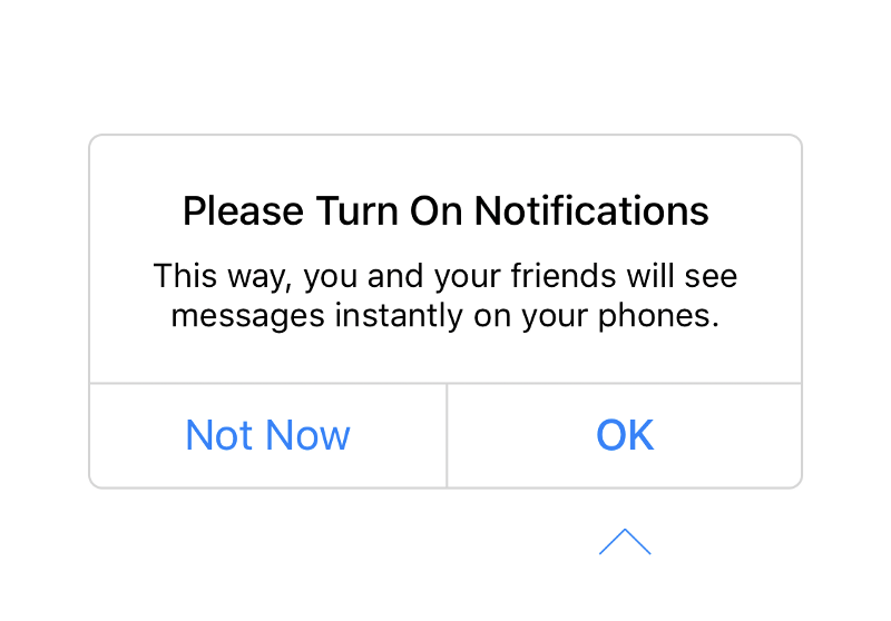 First, a pre-flight that the app is about to take its one shot at requesting systems access from the user (where Not Now tries to convince you to accept
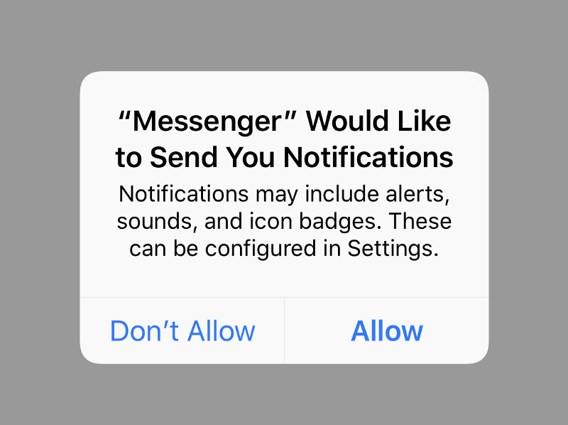 The standard operating system prompt asking the user whether to allow notifications to be sent to their device
If you tap "Don't Allow" above, the app will actually punish you in a cruel twist of irony by treating the lack of notifications as a notification itself:
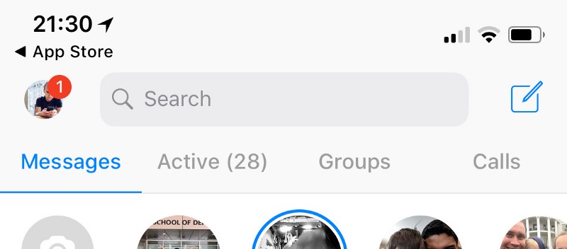 That `1` notification over my profile picture is not there to let me know someone messaged me
And tapping that camoflauged notification reveals only an urgent-looking setting to once again beat you over the head with entreaties to enable notifications:
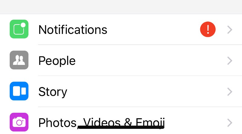 A "notification" that, once tapped, tells you that your life is empty and without purpose if you don't enable OS-level notification access
Naturally, this Notifications "notification" cannot be dismissed and will continue to annoy users for the life of their use of the app. This is such obviously exploitative design that I'm a little surprised Apple hasn't already addressed it with Facebook, but I suspect the reason they haven't taken action is because the vast majority of users will blindly tap "Allow" on every prompt the first time they launch the app.
And if you tap "Allow" on that prompt exactly one time? Well, then the OS takes grants that app permission to bother the user in perpetuity, interrupting them with sounds, badges, banners, waking up the device's screen, and tapping the watch as often as it wants and for as long as it wants. Once initially allowed, notifications receive nearly zero subsequent moderation from Apple.
Of course, iOS offers pretty granular privacy controls about which type of notifications an app can send, but no ability to throttle or de-prioritize them. And if the number of users who tap "Don't Allow" is too small for the above behavior to be seen as a problem, I'm hesitant to guess how few users will ever venture to an app's Notifications preference pane.
Apple could improve this situation dramatically by:
- Updating App Store policies to explicitly disallow this sort of user-shaming behavior and to start banning apps that violate it
- Leverage its massive wealth of information to identify apps that represent statistical outliers (say, apps that send the most notifications relative to users acting on them) and raise concern with the developer under the veiled threat that their access to APNS might be throttled or blocked
- Periodically suggesting to users that they trim down their notification settings based on onboard usage analytics (e.g. "You've ignored the last 40 'Clash of Clans' events it's notified you of, disable this type of notification?")
- Updating the "Allow" dialog to include more control over exactly which types of notifications the user chooses to opt into, similar to how the Location Services dialog was updated to allow users to choose whether an app should alway have access or only when the app is in use
4. Negativity feedback loops
It's almost popularly-accepted wisdom now that social media is making people more depressed, but little is being done to address this beyond individuals' occassional performative deletion of one's Facebook account on Twitter or of one's Twitter account on Instagram or of one's Instagram account on Snapchat.
On a recent episode his show, Ezra Klein said (paraphrasing), "the time I'm most likely to go on Instagram is when I feel most lonely… and it almost always leaves me feeling worse." That really resonated with my own experience with that (and other) "social" apps. In fact, I think it's the description of a really common feedback loop, in which:
- A person feels bad
- They open a "social" app to feel better
- That experience makes them feel worse
- Time passes
- A person still feels bad
- GOTO Step #2
If the only metric that defines success for an ad-supported social media app is maximal engagement, this vicious cycle is a feature, not a bug. Apple, who is fond of bragging that such engagement is not its business model in contrast to Facebook, is also the only fully-integrated platform holder that can hope to help people break from this negative feedback loop.
Some ideas:
- Log the amount of time spent on each app, and for apps that people open dozens or hundreds of times a day, actively suggest to users that they consider checking it less frequently
- Additionally, give users the tools to proactively restrict their access to apps and websites they believe to be exploitative or addictive. Restrictions could take the form of limiting screen time devoted to the app, which time of day it can be accessed, or just block it outright to help people break unhealthy habits
- Leverage the increasing biometric data available on devices to (securely but inevitably creepily) monitor information like a user's perceived emotional state based on their heart rate and facial expressions over time and make real-time suggestions when their emotional well-being might be suffering. This could be as simple as suggesting the user take a break from the device or as specific as a warning like, "your stress level has increased since you opened Instagram 15 minutes ago." Subsequent calls-to-action could encourage the user to switch activities to something less obvious but more likely to improve their mood (I am always happier after calling my friend Jeff, but coordinating our schedules is just barely high-friction enough that I tend to bum myself out by checking Twitter instead)
5. Several people are typing
When I first saw Zach Holman give some rendition of his talk about work at GitHub, one point he hammered home was how much of their productivity was unlocked by "asynchronous communication." Instead of having comparatively synchronous calls and meetings to update one another on their work's status, the utopian world depicted in the talk was one in which people could drop a note in the team's chat (then Campfire, but these days Slack) with zero expectation that other members immediately read or respond to it. When each person controls when they go and check the chat room, their productive flow isn't at the mercy of interruption or whatever times of day meetings might have been scheduled.
This was a very good point, and one that I really bought into for a few years. But then we all went and completely ruined chat apps with push notifications, online/offline status bubbles, and typing indicators. Because even though a chat room might seem like an async, pull-based communication medium, in reality most people will have default notifications pestering them constantly all day. Or their team will slowly and subconsciously grow to equate a green "online" status bubble with "at work" and an "offline" bubble as meaning "absent from work". And while it might feel like you can fire off a comment and then immediately get back to work, in truth most people will wait a little while for an immediate reply, see a typing indicator and then wait on it, falling right back into extremely latent synchronous communication.
Typing indicator UI controls manage to rob the user of their full attention for indeterminate periods of time while offering virtually nothing useful for the user to do while they stare at the app. Worse, often someone will start typing a reply only to give up entirely after 30 seconds, often in the interest of not wasting others' time! How much cumulative time have you spent watching a typing indicator start, then stop, then start again only to have it disappear entirely?
For what it's worth, Slack's iOS app can be configured to disable the typing indicator:
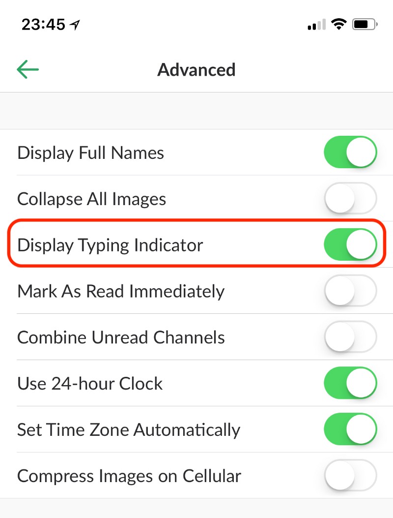 You should probably uncheck this
This is all to say nothing of the other risks inherent in replacing equally accessible, high bandwidth voice and video chats with often semi-synchronous text chats, which often consume more time and convey less situational and emotional context.
So, how could Apple make this better?
- Kill the typing indicator in iMessage, full stop. There's no point showing the user something they can't act on and the benefit of knowing to pause and wait for more messages are outweighed by the costs (and might be separately improved by better notification batching)
- By default, defer sending non-urgent communication in its own apps, as a sort of society-wide exponential backoff algorithm. For example, by default, Mail.app could send new e-mails after a random 5, 15, or 30 minute when a user hits "Send". This could be marketed as giving ample time to correct any mistakes, but it would have the happy side effect of preventing people from turning e-mail into a de facto instant messaging client (a thing that actually happens at numerous workplaces). This could all be accomplished while still giving users an explicit "Send now" action when a message is truly time-sensitive.
Do Not Disturb while living
I've thought a lot about Apple's "Do Not Disturb while driving" announcement for last year's iOS 11, especially since it was the only feature even tangentially related to my own wish list of features for that iOS release. The feature has its quirks but it works well enough most of the time. What's always struck me odd about Do Not Disturb while driving isn't what it is or how it works, but rather that it exists at all.
Apple clearly thinks notifications are great, because almost all of their platforms are lousy with them. But here is this one very particular case in which Apple has signaled that being notified is Not Okay™, because receiving a notification while operating a vehicle could present a personal and public health risk. And yet, so far we've seen few signs that Apple has reflected much on the other personal and public risks posed by the global-scale connectedness their platforms have enabled.
This all makes me wonder whether anyone at Apple has a full time job to ask and answer questions like:
- When a user uses an app more often, is that a sign it's genuinely benefiting them or might using the app be triggering or exacerbating a mental health issue like depression or addiction?
- When a user interacts with an Apple device, how often do they perform the activity and immediately put it away successfully? How often do they stay on the device, distracted by other things? How often does a notification or badge icon ultimately derail them from doing the thing they set out to do in the first place?
- Is the always-on, distracting nature of iOS and other modern software platforms partly to blame for the unrealized productivity gains normally predicted by technical innovation? How many trillions of dollars might have been wiped out from global GDP figures around the world due to Apple's Push Notification Service?
- If we mitigate the damage that connectedness has wrought on our default levels of focus and capacity for creative, productive work, what proactive things could Apple be doing to actually enhance our productivity beyond that baseline? (I can't be the only one who used to joke I was way more productive on planes, at least until wi-fi on planes became ubiquitous.)
If Apple doesn't have teams dedicated to this problem, they should. I don't know about you, but I'd gladly pay $2000 for this year's flagship iPhone if it could save me a commensurate amount of time by keeping me less unnecessarily connected. Life's too short.
And lastly, if you enjoyed this post, you might also like the book Deep Work. (Though, by having successfully made it all the way to the bottom of this post, you may need the book less than I did.)