Making a nice 2FA / OTP / SMS field with Tailwind & Stimulus
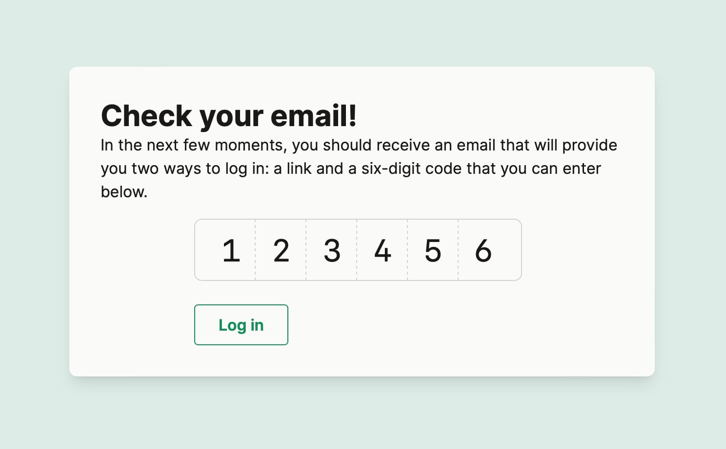
So, I built this little bit of UI today as part of an email-based authentication flow for Becky's new app:

(I haven't shipped this yet and I'm too lazy to record a screencast, so just imagine that this field behaves perfectly, please and thank you.)
If you, like me, have ever found yourself in the thrall of a beautiful-looking 6-digit form when logging into some site, whether when filling a TOTP from your authenticator app or copy-pasting a code that's been texted or e-mailed to you, you've probably wondered "how'd they make that field look nice like that?"
Well, today I actually started digging into it, and I didn't like what I found. At all.
Since I'm working on such a form, I started by reverse-engineering half a dozen popular services' cute-looking OTP form fields. Then Googling for solutions. Then getting mad at ChatGPT for a while. And you'll never guess this, but I found a common thread across how real forms in the wild are designed, what popular component libraries do under the hood, and what less-enlightened tutorial posts instruct their readers to do: pretty much everyone implements fancy TOP form fields following some variation of the following terrible, horrible, very bad, no good way:
- Render and style 6 distinct
<input>tags - Write some JavaScript to translate every conceivable keyboard and mouse navigation between them (and inevitably miss a bunch of edge cases)
- Add JavaScript to handle copy/pasting appropriately, since 90% of users are going to paste the code as opposed to type it out
- Add JavaScript to ensure you don't break Apple's very pleasant "one-time-code" auto-completion flow
- Add JavaScript to stitch together the 6 individual input tags, assigning the value to a hidden form field such that it all gets submitted appropriately
- Sprinkle in enough
aria-*attributes to receive absolution from the accessibility gods for all the sins you committed in steps 1-through-5
I only found one implementation that didn't split the code up over multiple artificial inputs, but it was ugly as hell and its CSS was inscrutable.
Here's what I wanted (and built, as pictured above) instead: a normal, minimally-adulterated text input field. And with everything else—the rounded border, the border between the digits, and so forth—implemented separately as inert styling.
So, if you're interested, here's where I wound up at the end of this week's episode of, "I guess I'll roll my own thing while spending all day muttering to myself that surely I shouldn't need to."
First, the markup (implemented in ERB because Rails and Tailwind, because it's awesome):
<!-- app/views/logins/_otp_input.html.erb -->
<div class="relative w-[320px] h-[64px] mt-[16px] sm:w-[368px]">
  <%= text_field_tag :otp_code, params[:otp_code],
    maxlength: 6,
    inputmode: "numeric",
    pattern: "\\d{6}",
    class: "absolute inset-[16px] focus:ring-0 focus:outline-hidden border-none font-mono text-[26px] sm:text-[32px] tracking-[26px] sm:tracking-[32px]",
    autocomplete: "one-time-code",
    title: "six-digit code that was emailed to you",
    data: {controller: "otp", action: "input->otp#caret click->otp#caret keydown->otp#caret keyup->otp#caret"} %>
  <div class="absolute flex sm:w-[336px] w-[284px] h-full border rounded-lg pointer-events-none bg-none">
    <% 5.times do %>
      <div class="w-[40px]  border-r border-dashed first:ml-[16px] ml-[2px] sm:w-[48px] sm:first:ml-[14px] sm:ml-[4px]" ></div>
    <% end %>
  </div>
</div>
Lots of stuff packed in the above, so probably best to read it closely and
Google anything that is unclear. The data attribute is all
Stimulus cruft.
And here's the JavaScript:
// app/javascript/controllers/otp_controller.js
import { Controller } from '@hotwired/stimulus'
import { useWindowFocus } from 'stimulus-use'

export default class extends Controller {
  connect () {
    useWindowFocus(this)
  }

  async focus() {
    this.pastePotentialCode()
  }

  caret () {
    const shouldHideCaret = this.element.maxLength == this.element.selectionStart
      && this.element.maxLength == this.element.selectionEnd

    this.element.classList.toggle('caret-transparent', shouldHideCaret)
  }

  async pastePotentialCode () {
    try {
      const text = (await navigator.clipboard.readText()).trim()
      if (text.match(/^\d{6}$/) && text !== this.alreadyPasted) {
        this.element.value = text
        this.alreadyPasted = text
      }
    } catch { }
  }
}
The Stimulus controller is focused on exactly two things:
- If the user's selection moves to the right of the last digit, it hides the I-beam carat, so it doesn't just blink off to the right in the middle of nowhere (I look forward to the caret-shape property giving direct control over this, though)
- If a user activates the window (hence the stimulus-use useWindowFocus import) and has a 6-digit code in their pastebuffer, fill the form field. (Thanks to privacy restrictions, this approach won't work on Apple platforms)
That's about it. I would have made a runnable example for you to play with, but I didn't really even feel like writing this, so you're lucky you get this much. And hey, what have you done for me lately, anyway?