Here's where you'll find my photos of cocktails. Screenshots of software bugs. Carousels of travel pics. You can also find these cross-posted to my Instagram account.
So much for Airplane Mode
My iPhone Air MagSafe Battery came in the mail today, and it was the first time I've ever seen this ridiculous sticker.
Does this mean the product can't be taken on passenger planes? Because the only risk factor other than the product the battery itself in the box is a few layers of cardboard.
Quick impressions on the product:
- It is a battery
- It can be charged via USB-C and charge other devices via USB-C
- It can connect to phones other than the iPhone Air, but generally only sideways, and iOS 26 handles it in software correctly (meaning whatever software integration Apple built for the product isn't gated to iPhone Air serial numbers)
- It will attach to MagSafe chargers but not charge from them
- I haven't tried putting my AirPods Pro 2 case on them, but wouldn't be surprised if it charged them
A simple calculation
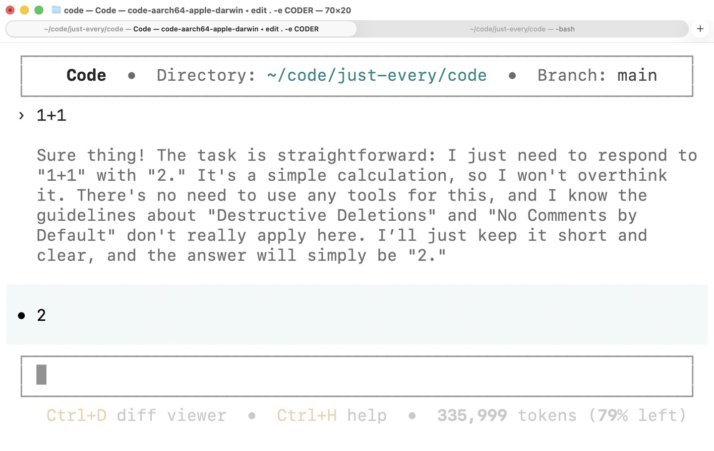
Whenever I need to verify a network connection with a remote LLM, I always ask it 1+1. I'm sure it'll still raise the ocean level by a millimeter, but it seems less bad than a more complex query.
I forgot I had unhidden chain-of-thought reasoning, so I chuckled when I got this:
Sure thing! The task is straightforward: I just need to respond to "1+1" with "2." It's a simple calculation, so I won't overthink it. There's no need to use any tools for this, and I know the guidelines about "Destructive Deletions" and "No Comments by Default" don't really apply here. I'll just keep it short and clear, and the answer will simply be "2."
At least it didn't overthink it.
You won't believe this Codex fork
Reddit turned me onto this just-every/code fork of OpenAI's Codex CLI last night. Since it uses the binary name coder to differentiate it from code and codex, I guess we should just call this thing Coder.
In addition to everything you get with Codex:
- A built-in diff viewer (Ctrl+D). If you're like me, you often have Claude Code or Codex open in one window and your preferred Git UI (I use Fork) in a second window, so having it integrated is wonderful. Moreover, while viewing a diff, you can press
eto request an explanation of the specific change you're looking at - Built-in browser support with ASCII previews (Ctrl+B) Like Playwright, it automates browsers over the very fast CDP, and it takes zero futzing to get started with it (unlike tacking an MCP tool onto Claude)
- Multi-agent consensus If you're a real sicko, you can hand the same question or task to all three of GPT, Claude, and Gemini and keep the consensus winner among them
Coder also has a themeable, more stable curses-like UI (as opposed to top-level terminal scrollback). It's the rare case of a community taking a heavily-funded corporate open source project and adding a lot of visual flair and spit polish to it. But I'll be damned if this isn't a much nicer experience than either Claude Code or Codex out of the box. (I can't speak to OpenCode, but since it doesn't support ChatGPT subscriptions, I'm not interested in it.)
Shout for DANGER
Free idea for anyone who wants it.
I've been juggling so many LLM-based editors and CLI tools that I've started collecting them into meta scripts like this shell-completion-aware edit dingus that I use for launching into my projects each day.
Because many of these CLIs have separate "safe" and "for real though" modes, I've picked up the convention of giving the editor name in ALL CAPS to mean "give me dangerous mode, please."
So:
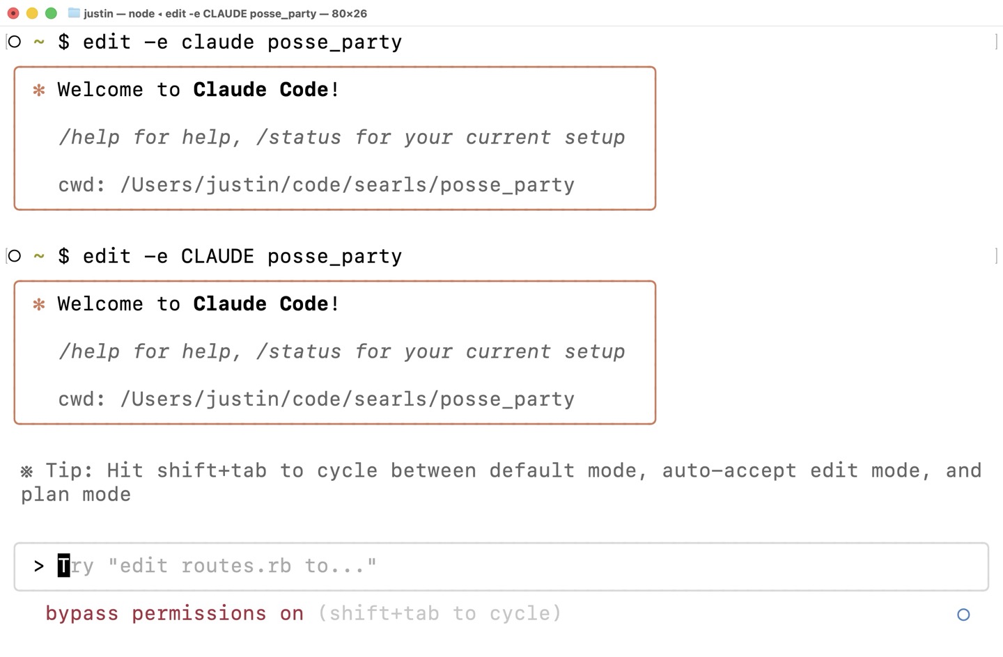
$ edit -e claude posse_party
Will open Claude Code in ~/code/searls/posse_party in normal mode.
And:
$ edit -e CLAUDE posse_party
Will do the same, while also passing the --dangerously-skip-permissions flag, which I refuse to type.
Invoice for my first Mac (2004)
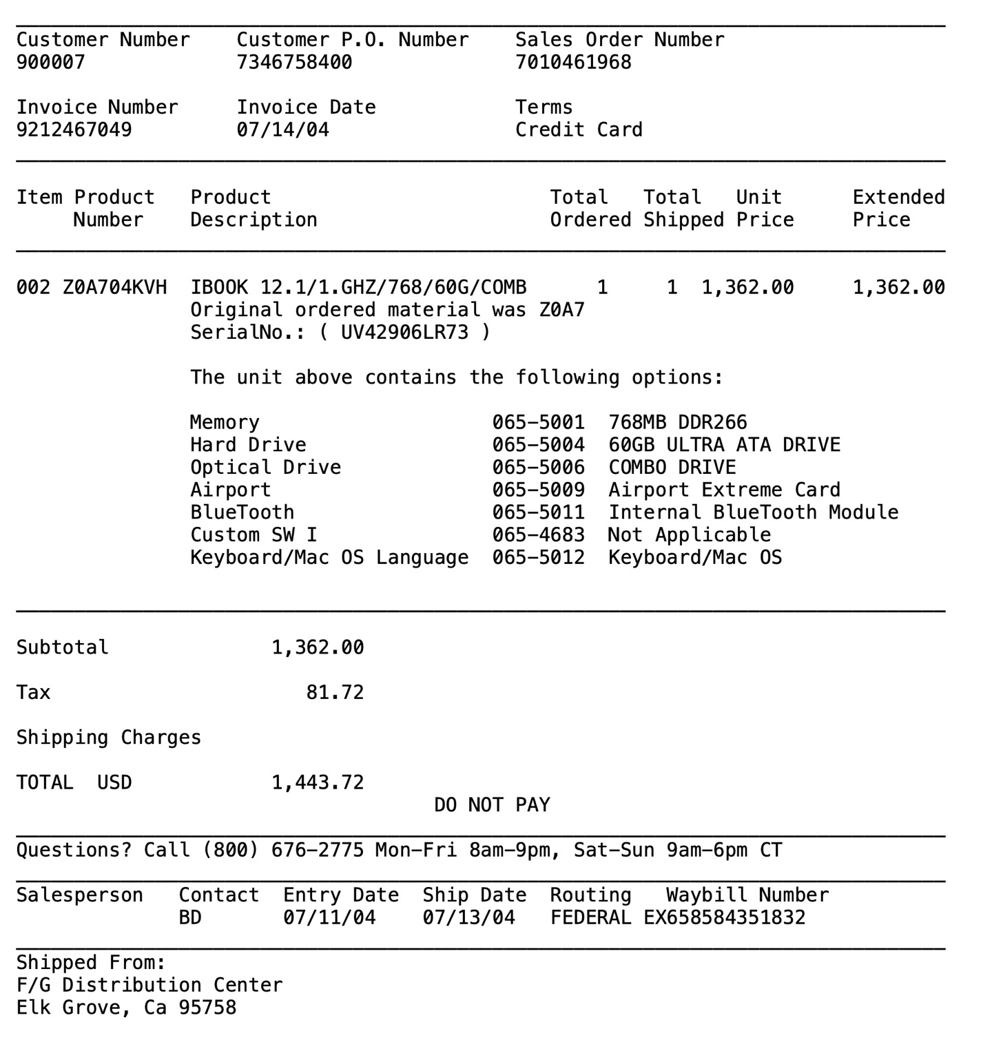
Thanks to a bug in Apple Mail, my Gmail archive likes to revert to sort by ascending date every now and then. Today, I scanned through some of those early emails and stumbled upon this incredible artifact: the e-mail invoice from Apple.com for my first Mac. It was a build-to-order 12" iBook G4 in July 2004.
Besides being set in such carefully-coifed monospace plaintext, the invoice provides an almost hilarious level of detail and verbiage by today's standards. Also, it never gets old to marvel at how much computers have depreciated over time. A whopping $1,362.00 for a mid-tier build of Apple's smallest, cheapest laptop in 2004. That's $2,317.82 in 2025 dollars after inflation. Today, the cheapest laptop Apple.com will sell you is the M4 MacBook Air (in an unusually recommendable configuration), starting at $999.
Big thanks to my dad Fred for spoiling me with a second computer literally one year into college (for which he bought me a Dell in June of 2003), because I was so insistent on switching to the Mac. (I sure was an entitled piece of shit.) I really wish I'd managed to hold onto that thing—a lot of fond memories, looking back.
The full invoice follows:
Apple Computer, Inc.                               INVOICE RECEIPT

Please remit to:
FOR YOUR RECORDS ONLY

Customer Number    Invoice Number
900007             9212467049

Reference Date     07/14/04

Amount Due         .00


Please Reference Apple's Invoice Number on Your Remittance

Sold To:                                 Ship To:
Fred Searls                              Justin Searls
REDACTED                                 REDACTED
TRENTON MI  48183                        GRAND RAPIDS MI  49504
USA                                      USA

________________________________________________________________________________
Customer Number    Customer P.O. Number    Sales Order Number
900007             7346758400              7010461968

Invoice Number     Invoice Date            Terms
9212467049         07/14/04                Credit Card
________________________________________________________________________________

Item Product   Product                        Total   Total   Unit      Extended
     Number    Description                    Ordered Shipped Price     Price
________________________________________________________________________________

002 Z0A704KVH  IBOOK 12.1/1.GHZ/768/60G/COMB      1     1  1,362.00     1,362.00
               Original ordered material was Z0A7
               SerialNo.: ( UV42906LR73 )

               The unit above contains the following options:

               Memory                    065-5001  768MB DDR266
               Hard Drive                065-5004  60GB ULTRA ATA DRIVE
               Optical Drive             065-5006  COMBO DRIVE
               Airport                   065-5009  Airport Extreme Card
               BlueTooth                 065-5011  Internal BlueTooth Module
               Custom SW I               065-4683  Not Applicable
               Keyboard/Mac OS Language  065-5012  Keyboard/Mac OS

________________________________________________________________________________

Subtotal              1,362.00

Tax                      81.72

Shipping Charges

TOTAL  USD            1,443.72
                                    DO NOT PAY
________________________________________________________________________________
Questions? Call (800) 676-2775 Mon-Fri 8am-9pm, Sat-Sun 9am-6pm CT
________________________________________________________________________________
Salesperson   Contact  Entry Date  Ship Date  Routing   Waybill Number
              BD       07/11/04    07/13/04   FEDERAL EX658584351832
________________________________________________________________________________
Shipped From:
F/G Distribution Center
Elk Grove, Ca 95758


               Web Order Number: W8731448

               Billed To: Credit Card


________________________________________________________________________________
After Remitting Payment Retain This Portion Of Invoice For Your Records.

Please See Below For Terms And Conditions Pertaining To This Order.
________________________________________________________________________________

Apple Computer, Inc.
________________________________________________________________________________
TERMS & CONDITIONS OF SALE


ORDER STATUS  For order status information, you may visit
http://www.apple.com/OrderStatus or navigate to http://store.apple.com/ and click
the "Your Account" button to view the status of your order.

U.S. SALES ONLY  The Apple Store sells and ships products only within the
continental United States, Alaska, and Hawaii. No shipments can be outside the
United States. You may not export any products purchased at the Apple Store.

SALES TO END USERS ONLY  The Apple Store sells and ships products to end user
customers only.

RETURN & REFUND POLICY   If you are not satisfied with your Apple purchase of a
pre-built product, please call 1-800-676-2775 for a Return Material Authorization
(RMA) request within 10 business days of the receipt of the product. If the item
is returned unopened in the original box, we will exchange it or offer you a
refund based on your original method of payment. The product must be returned to
the Apple warehouse within 10 business days of the issuance of the RMA. All
products must be packed in the original, unmarked packaging including any
accessories, manuals, documentation and registration that shipped with the
product. A 10% open box fee will be assessed on any opened hardware or accessory.
If you purchased your order using an Apple Instant Loan or an Apple Business
Lease, you may be asked to provide a major credit card (Visa, MasterCard,
American Express, or Discover) for Apple to assess the 10% open box restocking
fee.

Please note that Apple does not permit the return of or offer refunds for the
following products:

  1. Product that is custom configured to your specifications
  2. Opened memory
  3. Opened software
  4. Electronic software downloads

NOTE: Apple recommends that you (1) use a carrier that offers shipment tracking
for all returns and (2) either insure your package for safe return to Apple or
declare the full value of the shipment so that you are completely protected if
the shipment is lost or damaged in transit. If you choose not to (1) use a
carrier that offers tracking and (2) insure or declare the full value of the
product, you will be responsible for any loss or damage to the product during
shipping. Please note that the United States Postal Service (USPS) offers limited
tracking capabilities and that there is a 30-calendar-day waiting period before
the USPS will initiate a trace.

DEFECTIVE ITEMS  If you discover what you believe is a product defect for any
Apple-branded product, please contact Apple Care Technical Support at
1-800-APL-CARE (275-2273). Such a defect, if any, is covered under the terms of
your product's warranty. Please refer to the warranty information and other
supporting documentation that came with your product. (See Product Warranty
section below for specific information about Apple's product warranties.)

If you discover what you believe is a product defect for any third-party product,
please contact the manufacturer directly for information regarding the
manufacturer's warranty.

PROOF OF PURCHASE  This receipt is your proof of purchase from Apple.

CUSTOM-CONFIGURED PRODUCT  We are pleased to offer product that is
custom-configured to your specifications, and we encourage you to review your
order carefully. Since the product is built to your specifications, the order
cannot be changed, modified, or canceled once your order is in production.

SUPPORT PRODUCTS  Support products (such as the AppleCare Protection Plan) are
subject to the terms and conditions that accompany those products. By requesting

services under those products or completing and returning to Apple any
accompanying enrollment forms, you agree to the terms and conditions that apply
to those products. Those terms and conditions take precedence over any
inconsistent provisions in these Terms & Conditions of Sale.

SALES TAX  Apple Store purchases will include sales tax based on the ship-to
location and the sales tax rate in effect at the time of shipping. If you phone
in your order, the Apple Store sales representative will provide the final dollar
total of your order including tax and any applicable shipping charges at the time
you place your order. If the sales tax rate for the state to which your order is
being shipped changes before the product is shipped, the new tax rate in effect
at the time of shipment will apply. The proof of purchase that Apple mails to you
will include any applicable sales tax.

PRICES  The Apple Store endeavors to offer you competitive prices on current
Apple products and selected refurbished and clearance products Your total order
price will include the price of the product (on the day of shipping) plus any
applicable sales tax and shipping charges. Apple reserves the right to change
prices for products displayed at the Apple Store at any time.

Should Apple reduce its price on any shipped product within 10 calendar days of
shipment, you may contact Apple Sales Support at 1-800-676-2775 to request a
refund or credit of the difference between the price you were charged and the
current selling price. To receive the refund or credit you must contact Apple
within 14 business days of shipment.

PRODUCT AVAILABILITY  Given the popularity of some products, Apple may restrict
the number of such items that you may purchase. Any product limit restrictions
will be posted on the Apple Store web site.  This information is subject to
change.

PRODUCT WARRANTY  The sole warranty for Apple-branded product shall be Apple's
standard Limited Warranty as set forth in the documentation that accompanies each
Apple product.

Non-Apple-branded/Third-party products are sold "AS IS" by the Apple Store, but
may be accompanied by their manufacturers' standard warranties. "AS IS" products
are sold by Apple as is, where is, and with all faults, and without express or
implied warranties from Apple. If you have questions about any manufacturers'
warranties that accompany such products, please call 1-800-APL-CARE (275-2273)..

OTHER TERMS AND CONDITIONS
- Apple is not responsible for typographical errors.
- Apple reserves the right to change the terms and conditions of sale at the
Apple Store at any time.
- Title and risk of loss to all products will pass to you on delivery.
- All sales at the Apple Store are governed by California law, without giving
effect to California's conflict of law provisions.
- No Apple employee or agent has the authority to vary any of the Apple Store's
policies or the terms and conditions governing any sale.
- Additional terms and conditions may apply to Education customers purchasing for
personal use. Please refer to the Education Individual sales policies located at:
http://store.apple.com/Catalog/US/Images/salespoliciesEdIndividual.html


02-CONS-05-09-03
My favorite Apple Podcasts bug
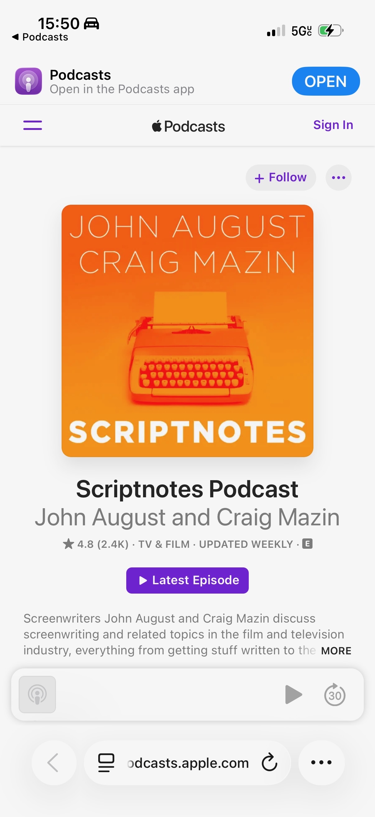
[2025-09-18 UPDATE: When the issue recurred just now on iPhone, it actually opened Safari to the universal URL of the podcast. That indicates this is less likely a bug in the Podcasts app than in some other cross-platform system capable of opening links on a trigger. (And the answer can't be Shortcuts, since it occurs on versions of macOS that predate Shortcuts' support for automation.)]
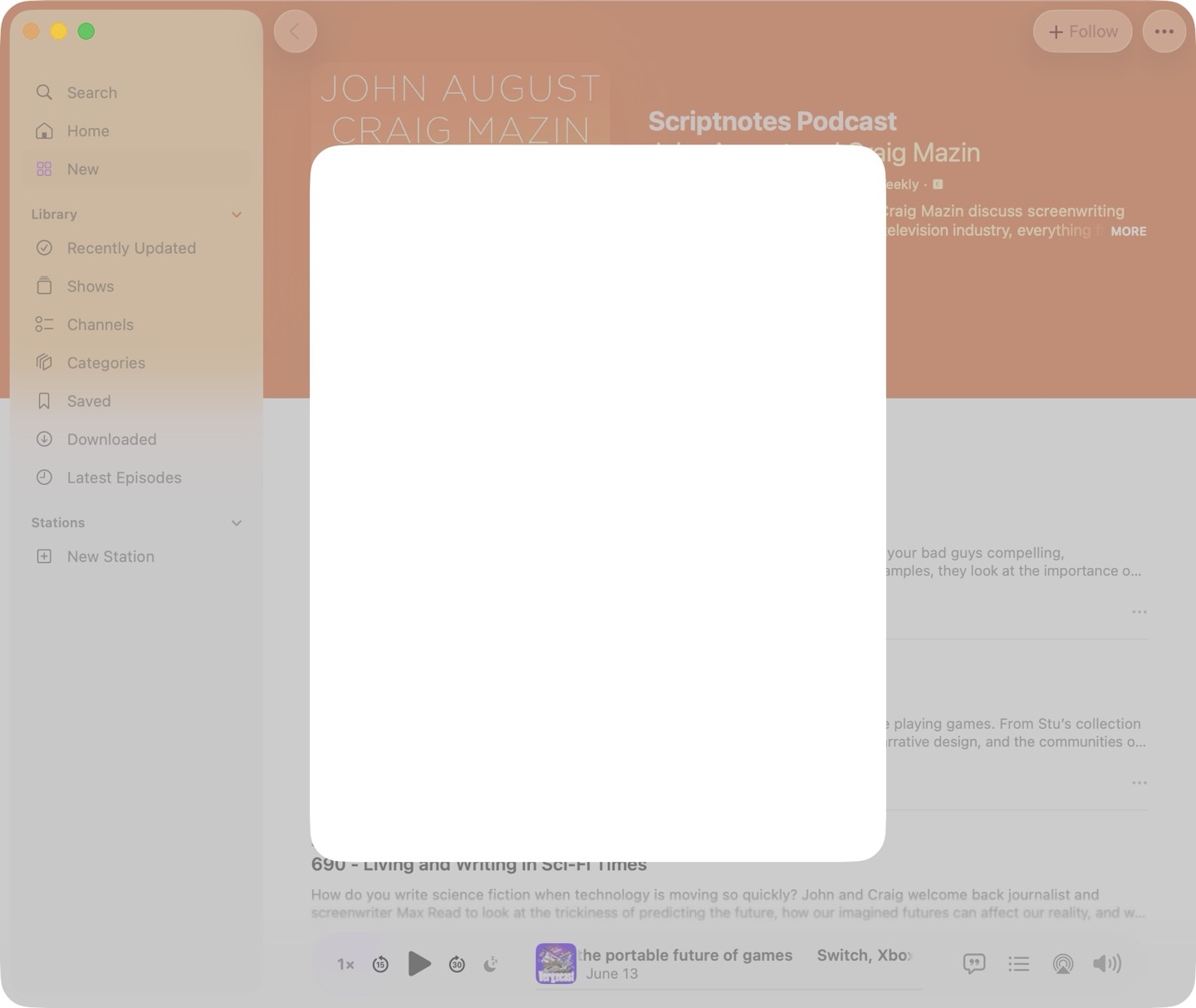
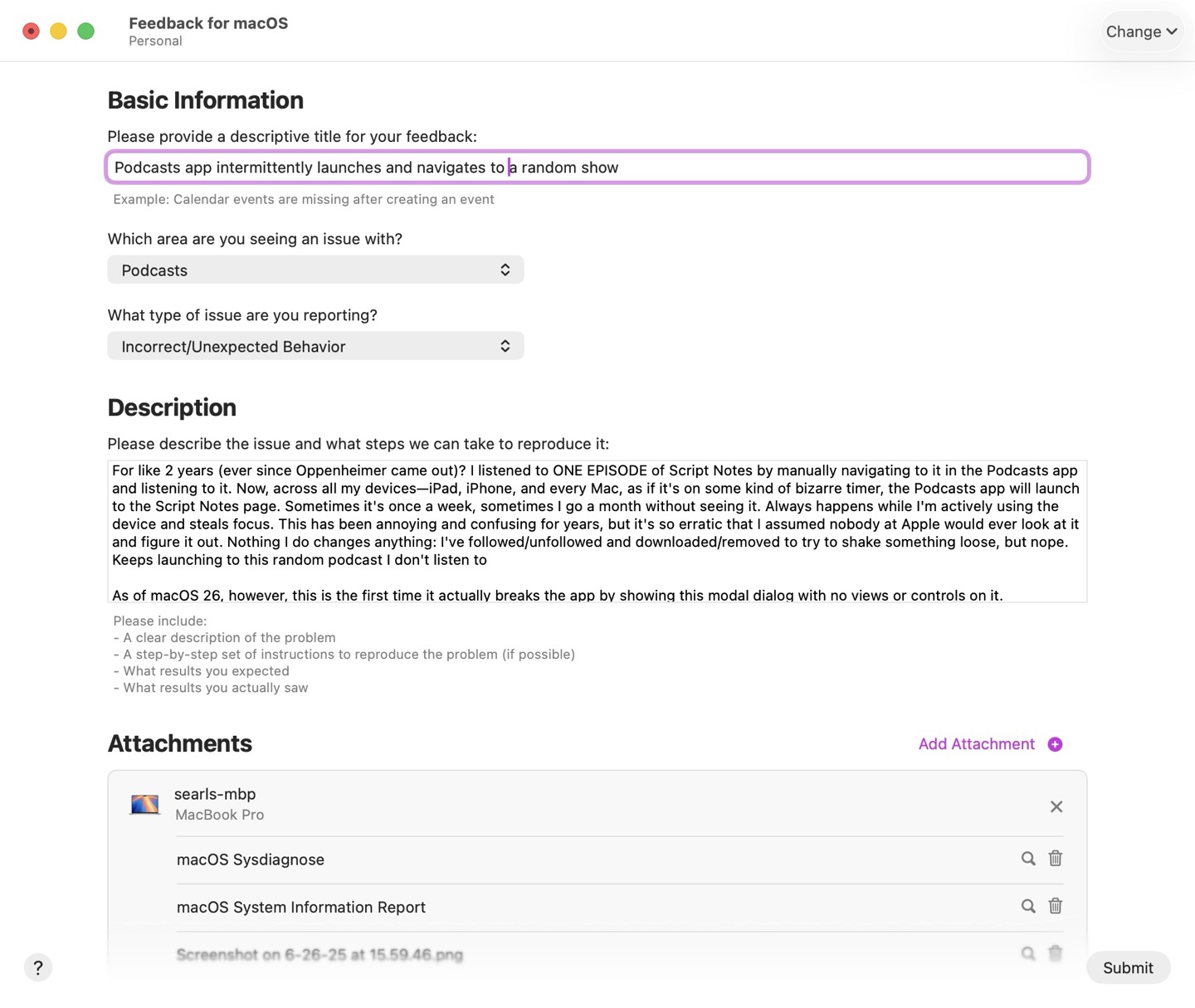
After almost two years of being annoyed by this, I finally submitted the most annoying bug I'm currently dealing with. Filed as feedback FB18414183 with description:
For like 2 years (ever since Oppenheimer came out)? I listened to ONE EPISODE of Script Notes by manually navigating to it in the Podcasts app and listening to it. Now, across all my devices—iPad, iPhone, and every Mac, as if it's on some kind of bizarre timer, the Podcasts app will launch to the Script Notes page. Sometimes it's once a week, sometimes I go a month without seeing it. Always happens while I'm actively using the device and steals focus. This has been annoying and confusing for years, but it's so erratic that I assumed nobody at Apple would ever look at it and figure it out. Nothing I do changes anything: I've followed/unfollowed and downloaded/removed to try to shake something loose, but nope. Keeps launching to this random podcast I don't listen to
As of macOS 26, however, this is the first time it actually breaks the app by showing this modal dialog with no views or controls on it.
Neat. 💣
Home Sweet Home
What my Japanese friends imagined when I told them I was headed back to Florida
Possy's been busy
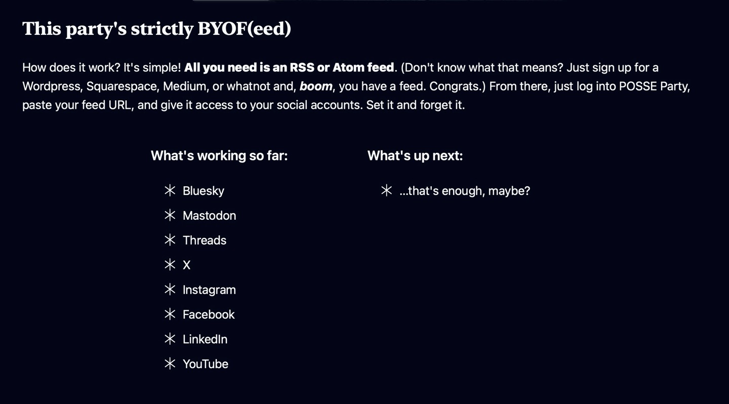
Earlier this year, I announced I was working on a Rails app called POSSE Party which allows users to syndicate their website's content to a variety of social platforms simply by reading its RSS/Atom feed.
Well, as of today, POSSE Party officially posts to just about everything I could want it to. This week, I locked myself in a tiny Tokyo apartment and didn't let myself out until I'd finished building support for Instagram, Facebook Pages, LinkedIn, and YouTube. That brings the total number of platforms it supports up to 8. I've updated this site's POSSE Pulse accordingly.
I'm excited and relieved to have realized the vision of what I set out to build. I'll be discussing what's next… soon-ish. Probably.
28 Allergens Not Detected
Sure this ice cream killed me, but think of all the allergens it didn't have!
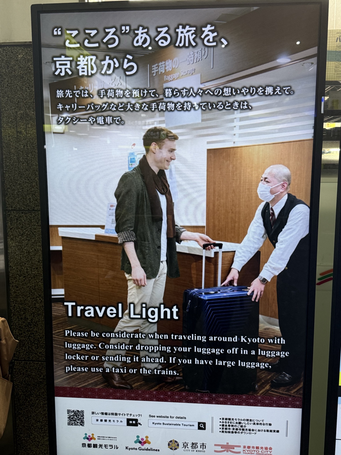
Death to roller bags
Nearly all Japan's overtourism woes could be solved overnight if the nation simply outlawed roller bags.
I'm edge cases all the way down
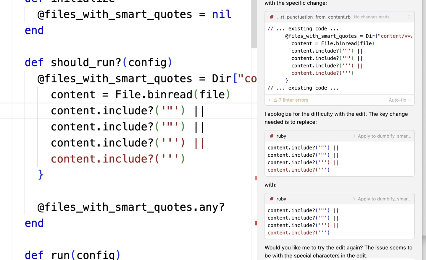
I feel like everything I try to do is so weird that when it doesn't work, I'm very often the first person to run into the bugs I discover, and I just ran into a pretty good example. Pretty sure Cursor ships with system prompts designed to prevent it from inserting smart quotes into code listings, because that would normally be a bug… but it also means the agent is constitutionally incapable of writing a script that searches for and replaces smart quotes.
It has been confused about why it can't type smart quotes for quite a while now. Neat.
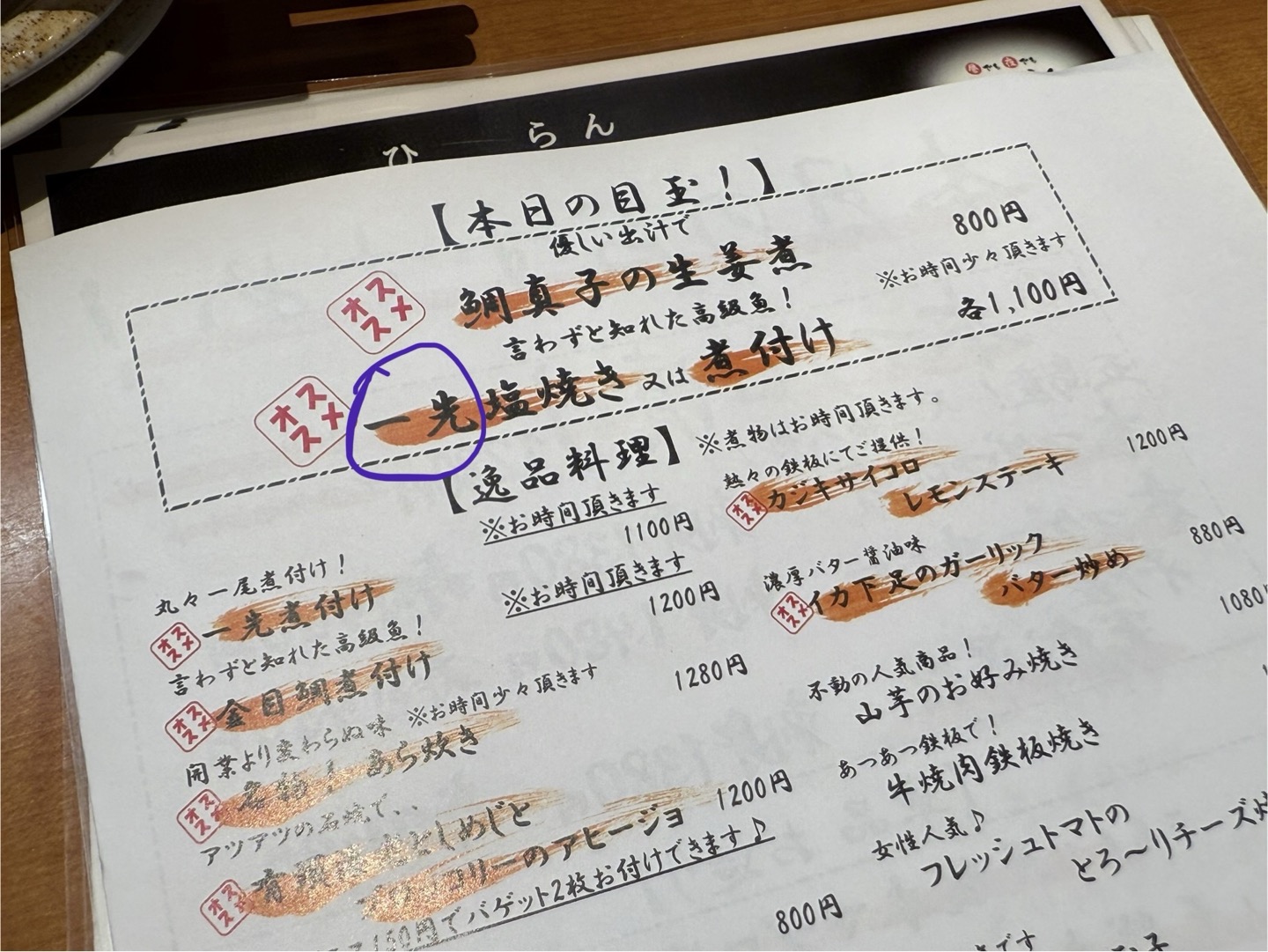
This fucking fish
Felt extremely stupid not knowing how to pronounce this fish.
Asked waitress. She didn't know
Neighboring elderly couple next to me didn't know.
Sushi chef across counter didn't know.
Took three staff members to identify it as "isaki"
Was an incredibly validating moment
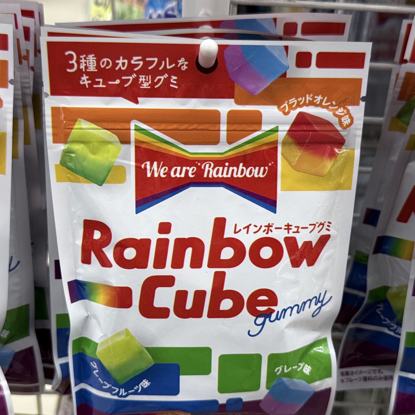
We are Rainbow
These gummy candies are the first rainbow-themed things I've seen so far this Pride Month.
(I bought them. They were good 🌈)
Try this Milk Sour!
An accident of language—the fact that "sour milk" sounds so unappealing—is probably why nobody in America ever considered making a "milk sour", which is just... exactly what it sounds like.
Milk and liquor, together at last.
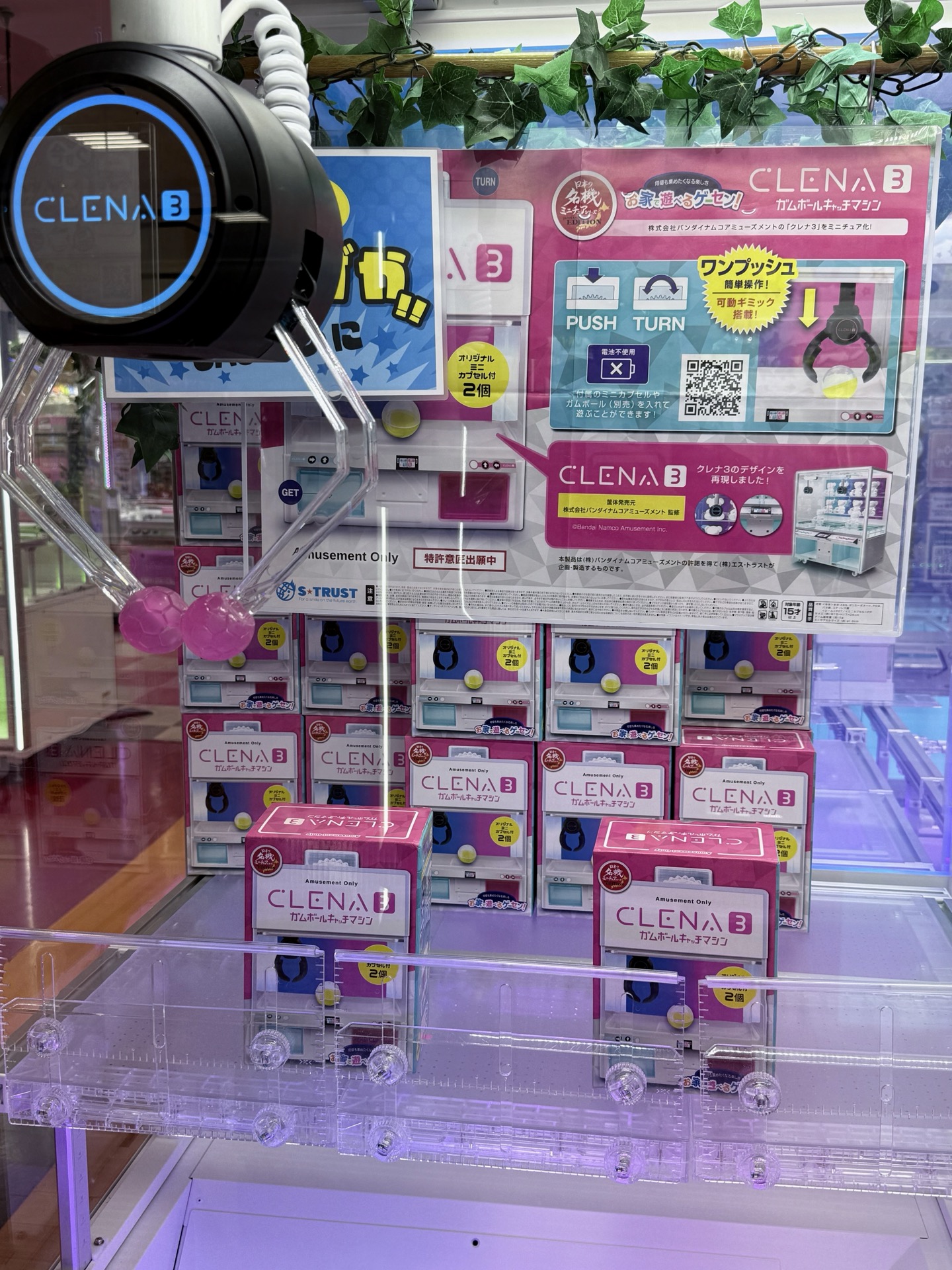
It's crane games all the way down
Finally, a crane game where the prize is another crane game.
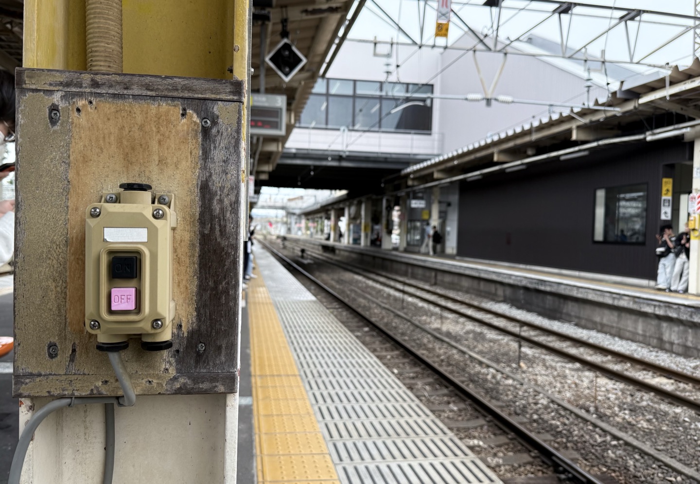
Forbidden Button
I have never wanted to press a button more than I want to press this button
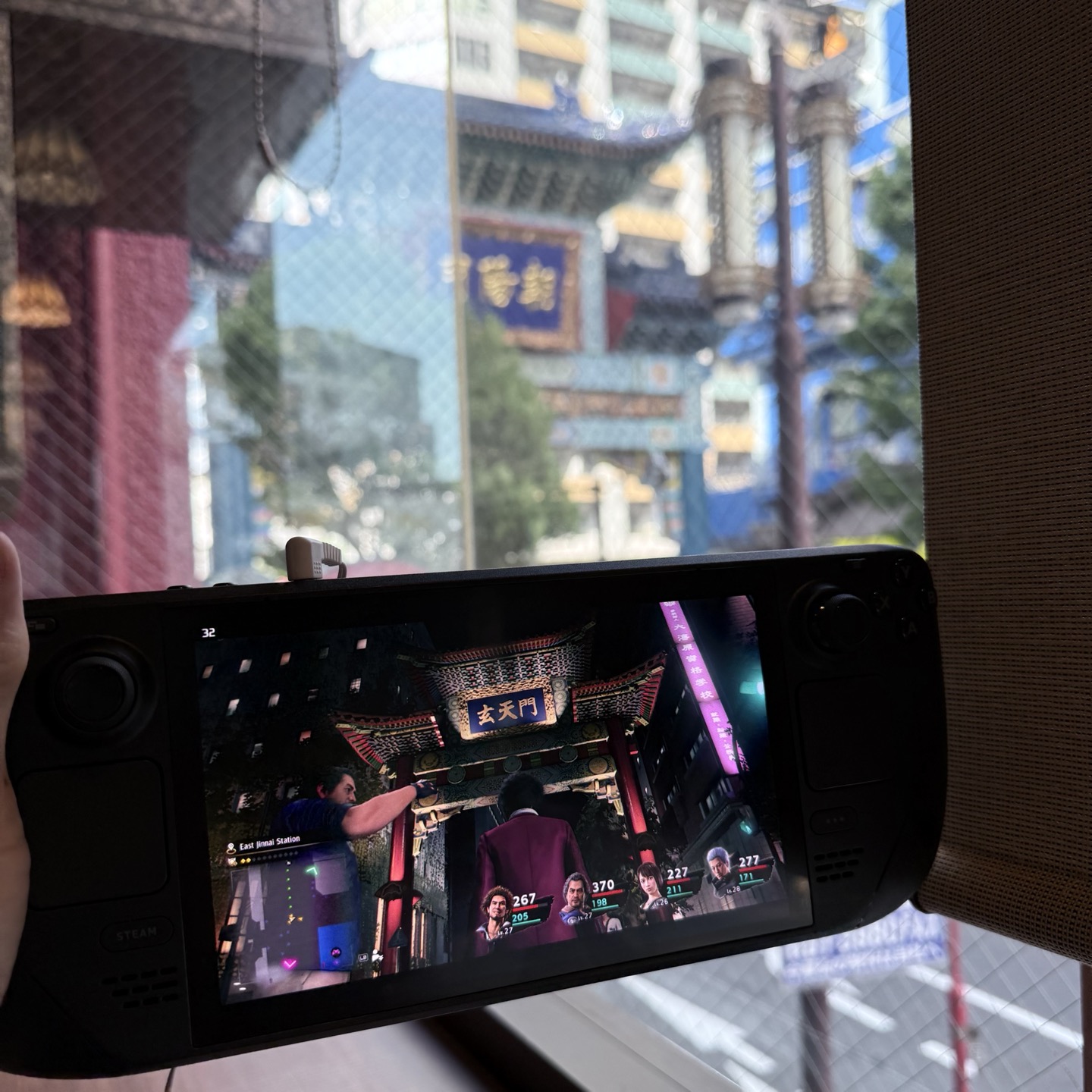
Like a Yakuza
Was hunkered down at a cafe in Yokohama's Chinatown earlier this week while waiting for Becky to finish a workout and looked up from my Steam Deck to notice I was simultaneously standing under the same gate in Like a Dragon: Yakuza's
Soapy Snake
One thing I love about Japan are all the obscure Metal Gear Solid spin-offs that we never saw stateside.
If this is losing, I don't want to win
In Japan, it's common for bars to have a dice game with rules like:
- Snake eyes: free drink
- Even number: half off drink
- Odd number: double size, double price drink
I "lost" with both of these 1L whisky-fruit highballs. I sure don't feel like a loser, though.
Opinion | Ads linking to paywalled articles are stupid
I saw this promoted post in my Reddit feed and thought, "huh, maybe WaPo is trying to entice new readers with ads pairing gift links to articles and targeted demographics that might engage with them."
LOL, no. You click anywhere on this and you instantly get hit with a paywall.
Who is this for? Current subscribers that don't read the Washington Post? People who planned to subscribe and forgot?
Absolute idiocy.

