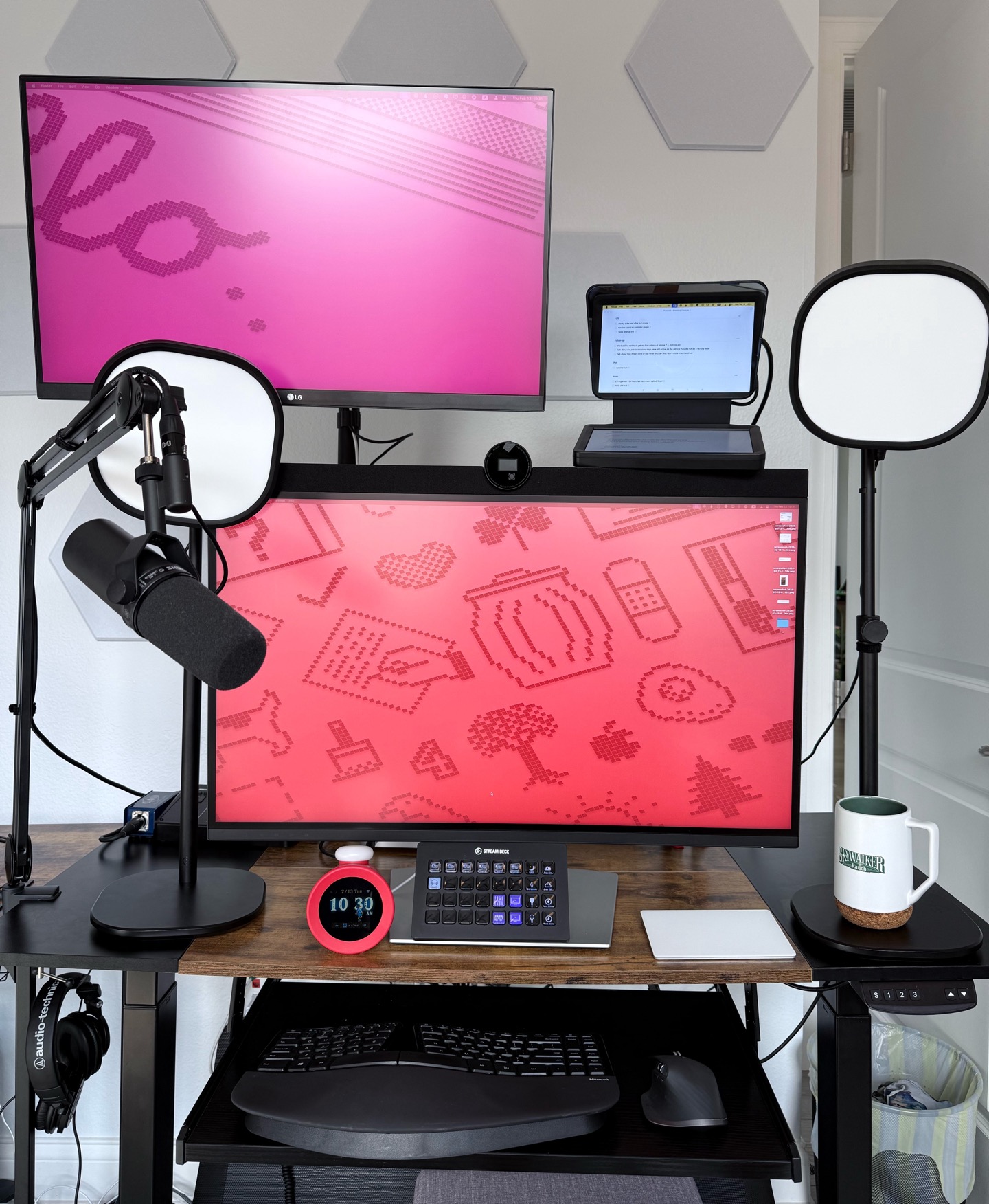
Mailbag day! This one from v31 of the podcast.
Namanyay Goel with a post that appears to be lighting the Internet on fire and is making me feel pretty smart about emphasizing the generational transition at which the software world finds itself:
We're at this weird inflection point in software development. Every junior dev I talk to has Copilot or Claude or GPT running 24/7. They're shipping code faster than ever. But when I dig deeper into their understanding of what they're shipping? That's where things get concerning.
Sure, the code works, but ask why it works that way instead of another way? Crickets. Ask about edge cases? Blank stares.
Imagine if your doctor had skipped med school, but—don't worry!—the AI tool built into his Epic tablet gave him the right answers to every question that happened to come up during your intake consult and your first physical.
Hopefully you never need anything serious.
Turning your audio podcast into a video-first production
I was chatting with Adam Stacoviak over at Changelog a couple weeks back, and he mentioned that this year they've taken their podcast "video-first" via their YouTube channel.
I hadn't heard the phrase "video-first" before, but I could imagine he meant, "you record the show for video—which is more complex than recording audio alone—and then the audio is a downstream artifact from that video production." Of course, key to my personal brand is failing to demonstrate curiosity in the moment by simply asking Adam what he does, and instead going on an individual two-week-long spirit quest to invent all the wheels myself based on the possibly incorrect assumption of what he meant in the first place.
Anyway, as of v31 of Breaking Change, my podcast is now, apparently, a video-first production. I figured I'd share my notes on the initial changes to the workflow, along with links to the products I'm using.
Here's the video:
And here's the extremely simple and easy 10 step process that got me there (with affiliate links throughout):
- Record audio and video in OBS
- Video is recorded in 4k@60fps in 8-bit HEVC as an MKV file (because MKV files, unlike MOV, can be interrupted by a crash without losing the entire recording)
- I use a Sony a7 mark IV over HDMI with Elgato Camlink 4K mounted via the Elgato Master Mount system and flanked on either side by Elgato Key Lights Air. I also have an Elgato Prompter in front of the lens that displays two windows, side-by-side: OBS on the left and my Things project with my show topics on the right
- I record audio tracks from an SSL 2+ USB interface
- Track 1 is reserved for the first XLR input, which has a bog-standard SM7b microphone plugged into it
- Track 2 is L&R of the loopback interface for music and stingers (here's my guide on setting up SSL2+ for loopback that allowed me to avoid software like Audio Hijack)
- Music and stingers are played manually from shortcuts on my Stream Deck XL
- While recording, if I need a break, I only hit PAUSE/UNPAUSE instead of STOP/START to ensure only one file is created
- When finished, leave it recording and then LEAVE THE ROOM for a minute to create some dead air I can later use to sample the room noise with iZotope's RX Spectral Denoise plugin
Update: This is the first version of Breaking Change available in 4K video. Check it out on YouTube.
The one where Justin picks the perfect time to buy his first Tesla vehicle.
Sometimes the things I say and do make people feel things. Share those feelings with me at this e-mail address: podcast@searls.co. Whatever you're feeling, I'll read it and do my best to acknowledge it. I also may read it on air. Unless you ask me not to, in which case I won't.
Okay, so anyway, there are links to be lunked:
A script to validate videos for the Instagram API
If you are publishing videos via the Instagram API (as I do for my feed2gram gem and for Beckygram), one of the first things you notice is that it is a lot less forgiving than their app is.
From their docs that spell this out:
The following are the specifications for Reels:
- Container: MOV or MP4 (MPEG-4 Part 14), no edit lists, moov atom at the front of the file.
- Audio codec: AAC, 48khz sample rate maximum, 1 or 2 channels (mono or stereo).
- Video codec: HEVC or H264, progressive scan, closed GOP, 4:2:0 chroma subsampling.
- Frame rate: 23-60 FPS.
- Picture size:
- Maximum columns (horizontal pixels): 1920
- Required aspect ratio is between 0.01:1 and 10:1 but we recommend 9:16 to avoid cropping or blank space.
- Video bitrate: VBR, 25Mbps maximum
- Audio bitrate: 128kbps
- Duration: 15 mins maximum, 3 seconds minimum
- File size: 300MB maximum
If you get this wrong, you'll receive a mostly-unhelpful-but-better-than-nothing-error message that looks like this:
{
  "message": "The video file you selected is in a format that we don't support.",
  "type": "OAuthException",
  "code": 352,
  "error_subcode": 2207026,
  "is_transient": false,
  "error_user_title": "Unsupported format",
  "error_user_msg": "The video format is not supported. Please check spec for supported CodedException format",
  "fbtrace_id": "AvU9fEFKlA8Z7RLRlZ1j9w_"
}
I was sick of hobbling together the same half dozen ffprobe commands and then eyeballing the results (which are typically inscrutable if you don't know what you're looking for), so I wrote a script to test this for me.
For example, a recent clip failed to syndicate to Instagram and I wondered why that was, so I ran this little script, which I put on my PATH and named validate_video_for_instagram. It output:
Validating video: /Users/justin/Documents/podcast/clips/v30-the-startup-shell-game.mp4

✅ container
✅ audio_codec
✅ max_audio_sample_rate
✅ video_codecs
✅ color_space
✅ min_frame_rate
✅ max_frame_rate
❌ max_horizontal_pixels - Maximum columns (horizontal pixels): 1920 required; got: 2160
✅ min_aspect_ratio
✅ max_aspect_ratio
✅ max_video_bitrate_mbps
❌ max_audio_bitrate_kbps - Audio bitrate: 128kbps maximum required; got: 256.073
✅ min_duration_seconds
✅ max_duration_seconds
✅ max_size_megabytes

❌ Video had 2 error(s) preventing API upload to Instagram.
Docs: https://developers.facebook.com/docs/instagram-platform/instagram-graph-api/reference/ig-user/media
Is it surprising that the Instagram API won't accept 4K video? Yes. Especially since the videos weighs in at less than 100MB.
Want this for yourself?
To run this, you'll need a modern Ruby installed and ffprobe installed (on a Mac with homebrew, brew install ffprobe should do).
After 15 years of sugar-coating it, I'm upgrading from kid gloves to… regular gloves, I guess?
The truth is and has always been:
- That the best way to get better at programming computers is to spend time programming computers
- That a lot of people don't do this, but expect the same salaries as those that do
- That one highly-competent developer can often run laps around entire software teams at the typical company
I'm done pretending this isn't true.
The Wrong Programmers
I'm as big a fan of searching for environmental and systemic explanations when expectations are missed, but that doesn't mean that sometimes the blame lies with the skill of the people doing the job. Decided I'm going to stop pretending as if that's never the case.
I have lost all control
Every time I sin, another device appears on my desk.
The Startup Shell Game
…the answer usually depends on everything OTHER than whether you're good at your job.
This clip is from v30 of Breaking Change.
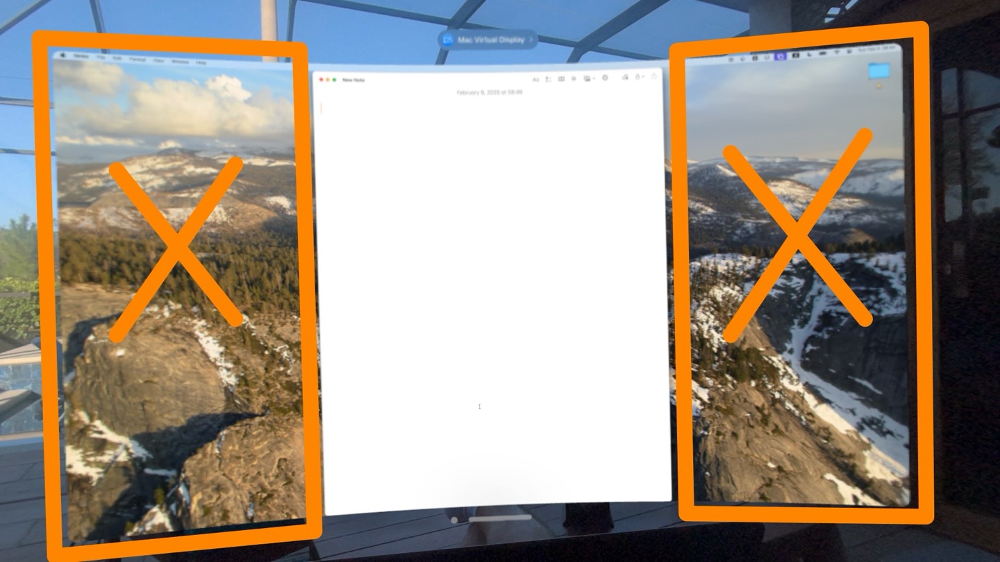
Ultra Narrow View
Vertical monitors for folks working on documents have been a thing for decades — now that Apple Vision Pro supports an 8K-ish ultra wide screen orientation for Mac Virtual Display, I'd love to see custom aspect ratios that allow you to create only as big of a Mac window as you need.
This is the first of what I hope will become a habit of long-form video excerpts from the podcast. This one comes from a section in v30 about DeepSeek and the ramifications it may have for OpenAI and the extent to which it condemns Sam Altman's ideology on how to run a startup.
What this patch has to do with me
This is a copy of the Searls of Wisdom newsletter delivered to subscribers on February 9, 2025.
It's taken me a while to figure out what to write for you that would tie a bow around January 2025. My take on the cultural and political realignment we seem to be experiencing? A deep dive into the video workflows I've been developing as an outgrowth of my Breaking Change podcast? Reflections on the distinct misery of feeling like one's life has regressed in some way, and the counter-productive ways American men react to the sensation of going backwards?
None of those felt quite right.
So I sat on the newsletter and waited for inspiration to strike. Then, out of nowhere, an unextraordinary patch for a developer tool I don't use got merged and—through a convoluted series of coincidences—will likely stand as one of the biggest accomplishments of my life.
I'll explain what I mean by that, but first, here's a picture of my brother and me at brunch in a boat-themed restaurant literally named Boathouse and seated at a table built into an actual fucking boat:

What this patch has to do with me
If you're not a programmer, fear not: I don't intend to get too lost in the technical weeds here. That said, some amount of exposition is necessary to convey why the aforementioned pull request matters.
20%? Sign me up!
Why freak out about tariffs and the economy when random signs on the side of the highways in Florida are able to offer such amazing investment returns?

Imagine the entrepreneur who started a UPS franchise 15 years ago with earnest hopes of connecting with the local community by offering services like private mailboxes and consultative shipping options.
Now imagine that person's life as a subcontractor of a subcontractor of Fulfillment by Amazon bound by an ironclad franchising agreement.
The Baby Store
Why I didn't have kids, despite the fact a lot of men seem weirdly OK with pretending they have zero regrets.
This clip is from v30 of Breaking Change.


